
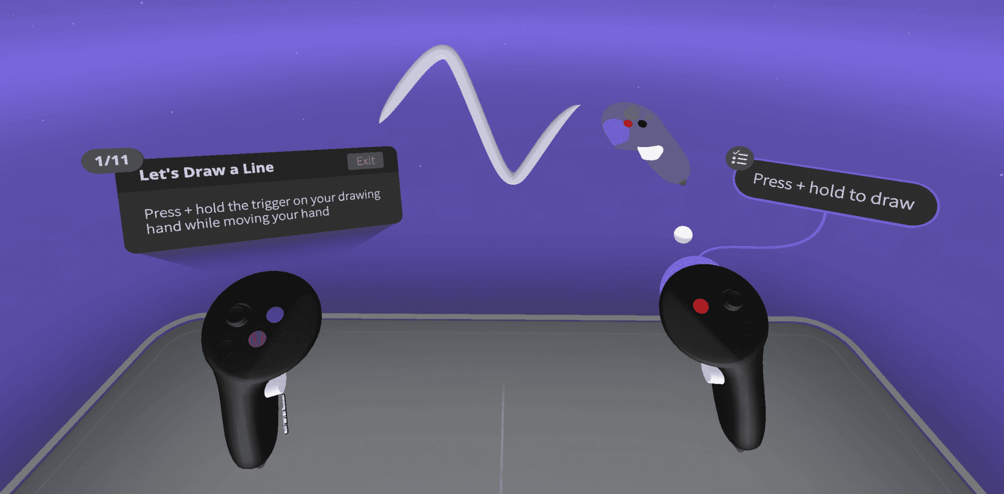
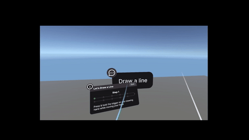
Old Design
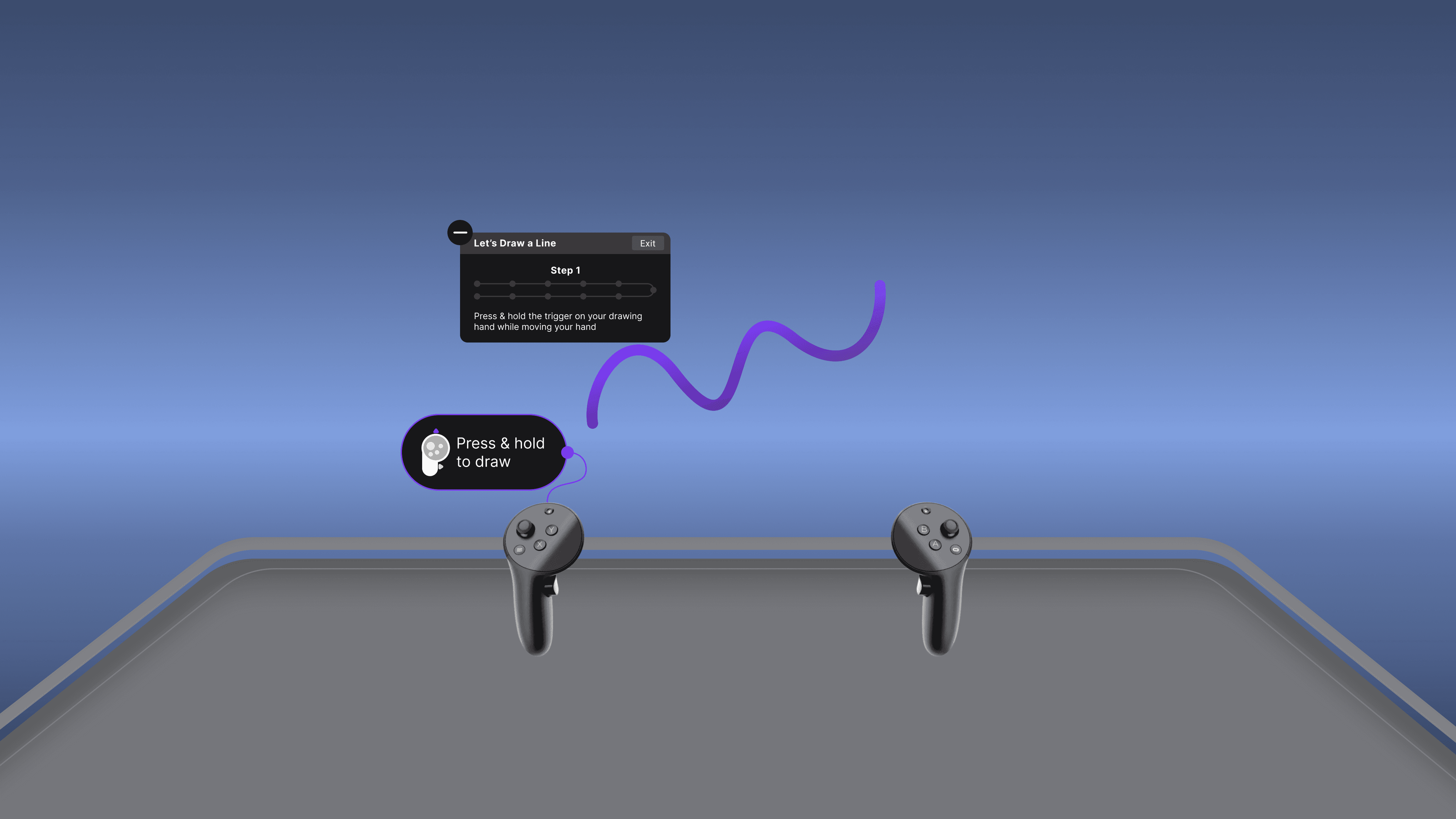
New Design
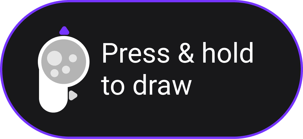
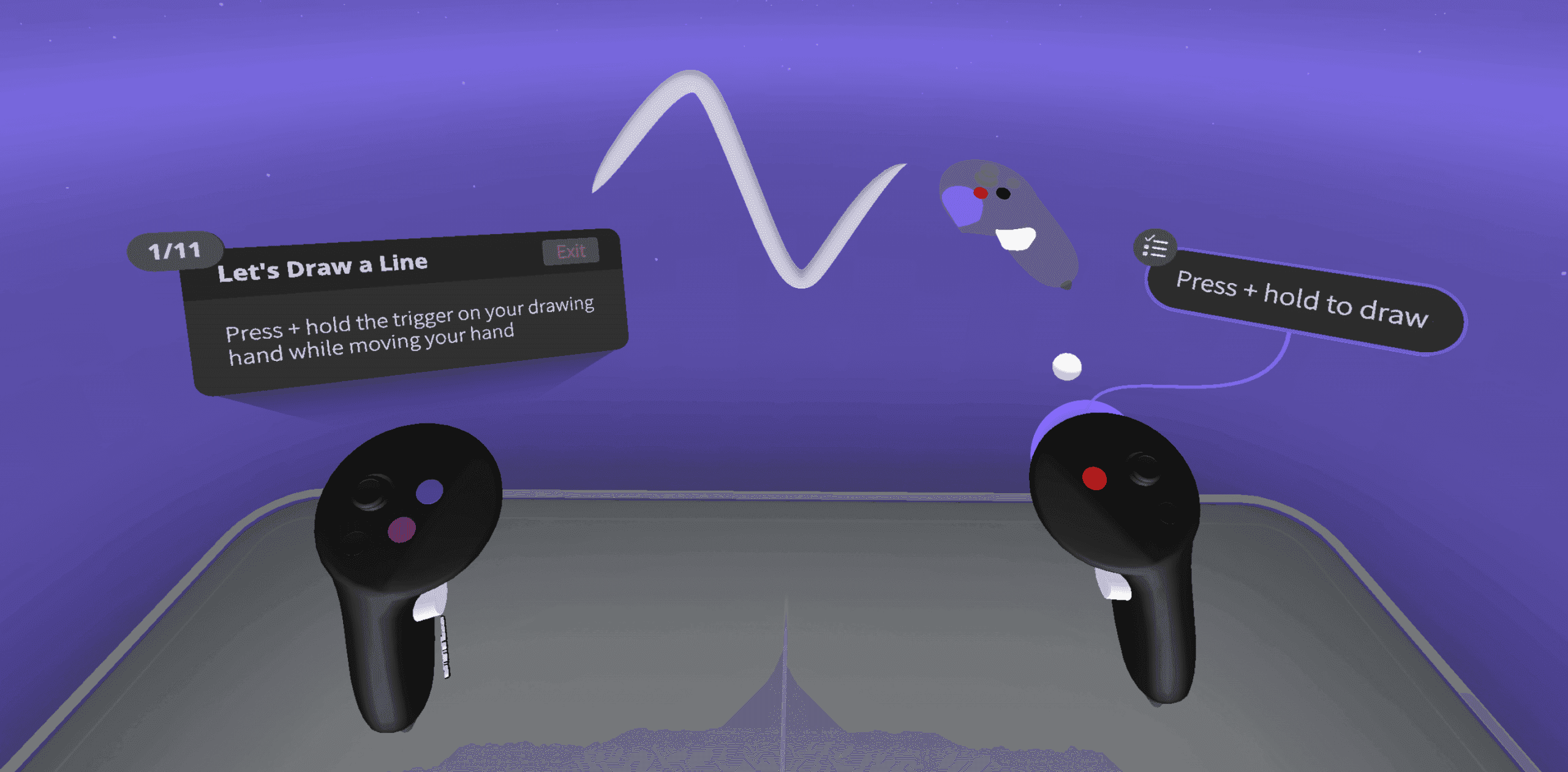
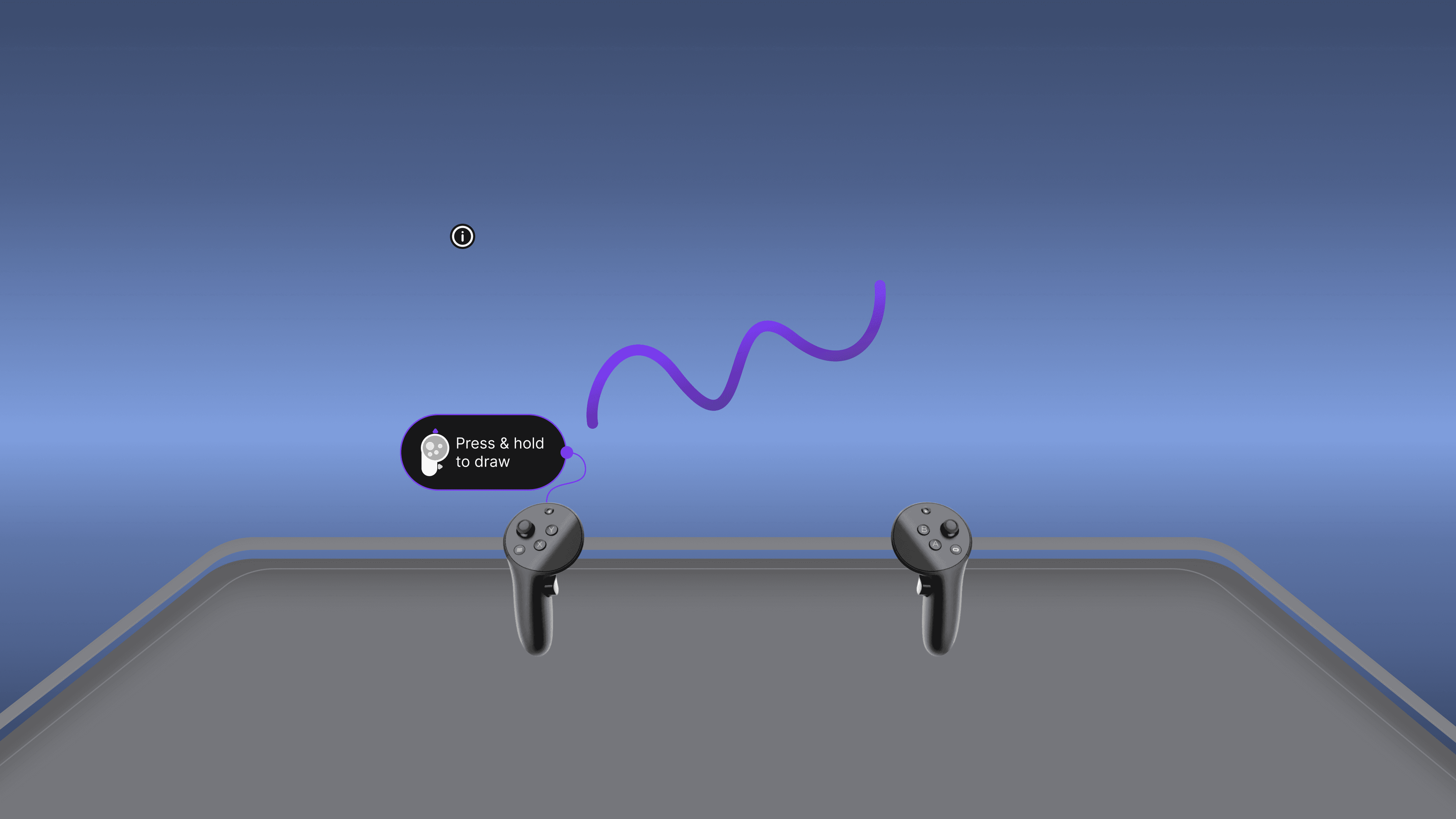
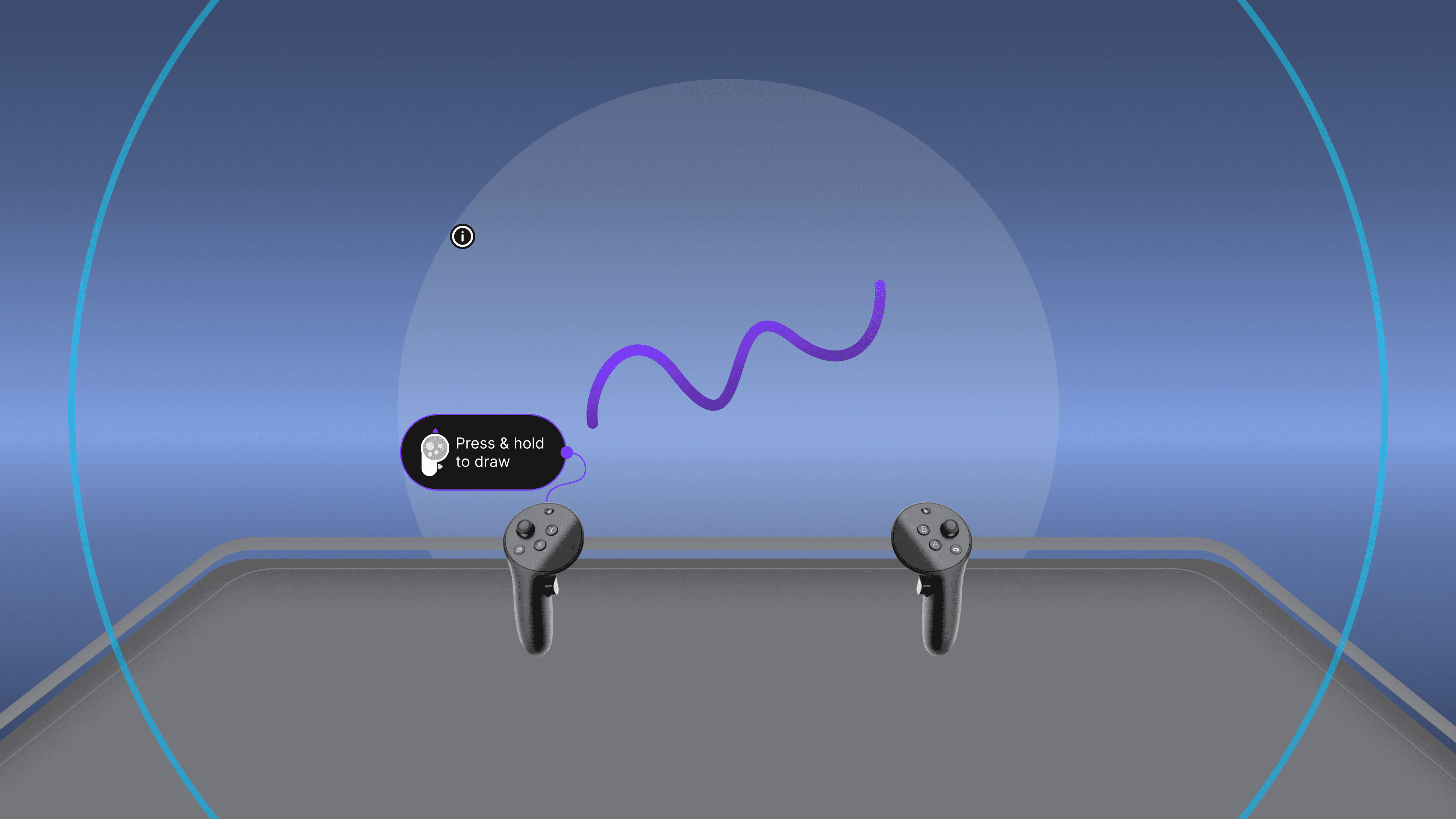
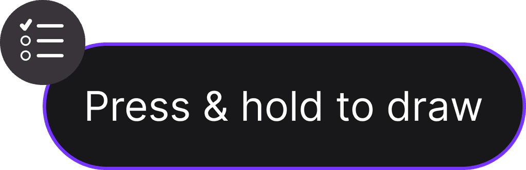
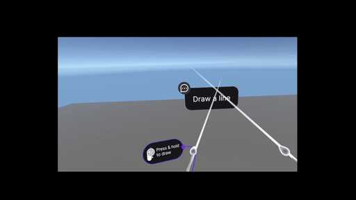
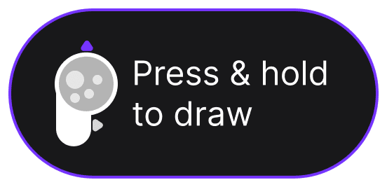
Press & hold to draw
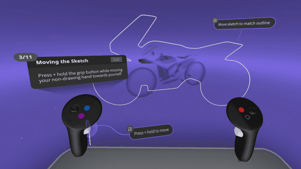
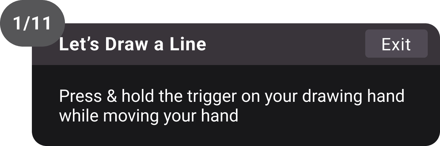
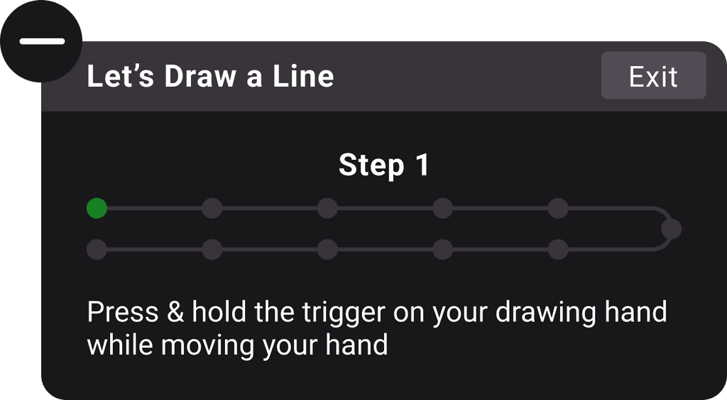
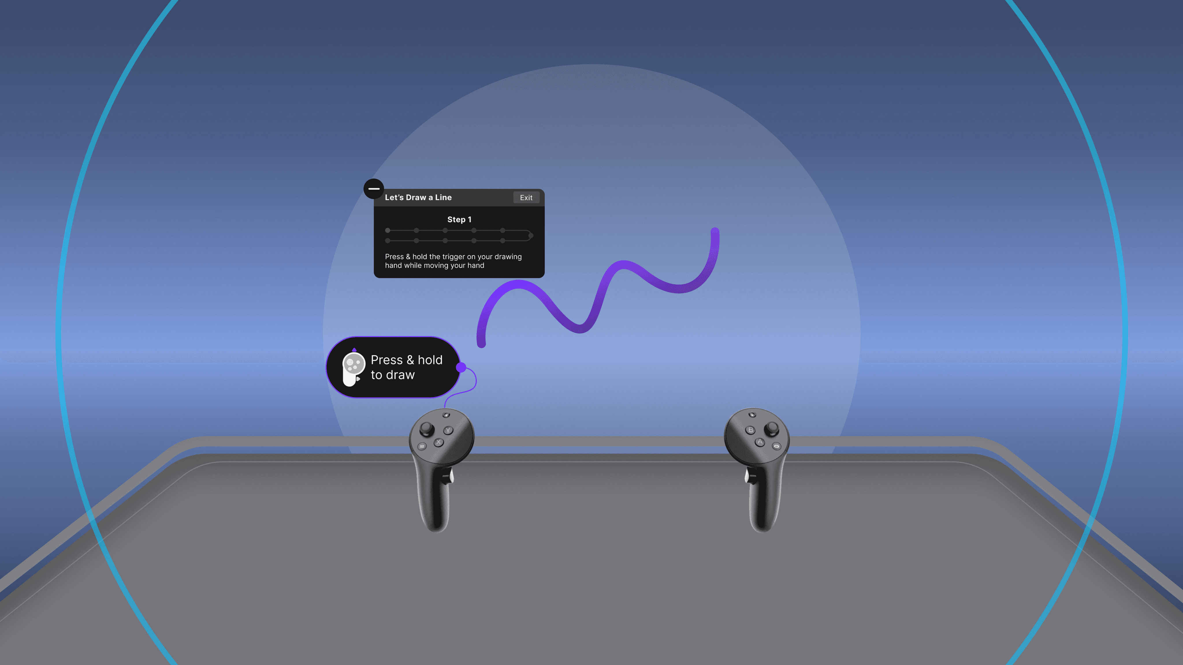
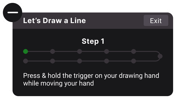
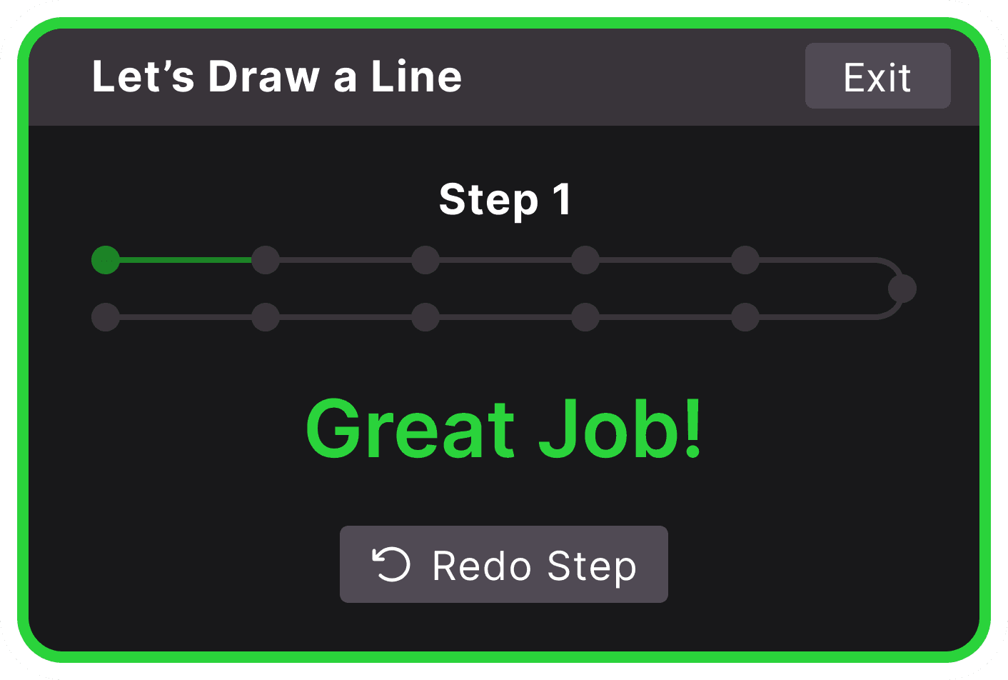
Let’s Draw a Line
Exit
Press & hold the trigger on your drawing hand while moving your hand
1/11
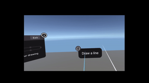
Old Design
Step 1
Let’s Draw a Line
Exit
Press & hold the trigger on your drawing hand while moving your hand
Press & hold to draw
New Design
Before & after of Onboarding Design
1
Discovery
2
Ideation
3
Testing
4
Results
1
Discovery
2
Ideation
3
Testing
4
Results
1
Discovery
2
Ideation
3
Testing
4
Results
Discovery
Discovery
Literature Review
Onboarding ensures a smooth transition and helps users understand the VR environment.
Focused on reducing motion sickness, cognitive overload, and user confusion.
Recommended step-by-step guidance and gradual feature reveal to enhance learning.
Suggested adaptable tutorials to accommodate different learning styles and experience levels.
Emphasized seamless integration, prioritizing clarity and comfort for new users.
Secondary Research
Key elements include interactive tutorials, clear visual cues, and feedback mechanisms.
Focused on intuitive navigation and ergonomic design for extended VR use.
Examined successful VR apps like Oculus Quill and Tilt Brush, noting segmented tutorials and adaptive guidance.
Effective onboarding boosts user retention and satisfaction.
Stressed practical scenarios and safe environments for learning VR interactions.
Survey Results
18- 24 age group
54%
54%

76%
76%

Find dedicated onboarding tutorials very important
Find dedicated onboarding tutorials very important
72%
72%

Would likely abandon a VR app if the onboarding is too difficult

89%
89%
Report that lack of clear instructions reduces enjoyment of VR apps.
80%
80%

Believe interactive tutorials would significantly improve initial VR app experiences
Clarity and simplicity are crucial for onboarding.
Lack of guidance leads to frustration and potential abandonment.
Usability Test and Heuristic Evaluation Summary
Usability Test and
Heuristic Evaluation Summary
Confusion Over Visual Cues
Violation : Visibility of System Status and Recognition Rather Than Recall.
Issue : Multiple visual cues are presented simultaneously, overwhelming users and causing confusion about which action to take.
"Why am i seeing these many tips? which one should I do first?"
Unintended Color Changes
Violation : User Control and Freedom, Error Prevention.
Issue : The color wheel interaction was too sensitive, causing users to unintentionally change colors.
"Why am i seeing these many tips? which one should I do first?"
Tool Selection Ambiguity
Violation : Match Between System and Real World, and Feedback.
Issue : Users were unsure if the correct tool was selected due to a lack of clear feedback.
" Did I select the right tool?"
Inaccurate Feedback
Violation : Visibility of System Status, User Control and Freedom.
Issue : The feedback mechanism was inconsistent, providing unclear guidance on task completion, leading to uncertainty and frustration.
" Where did I go wrong?"
Ideation
Ideation
I begin my design process by sketching out rough ideas on paper. This helps me quickly iterate and shape my approach towards finals designs.
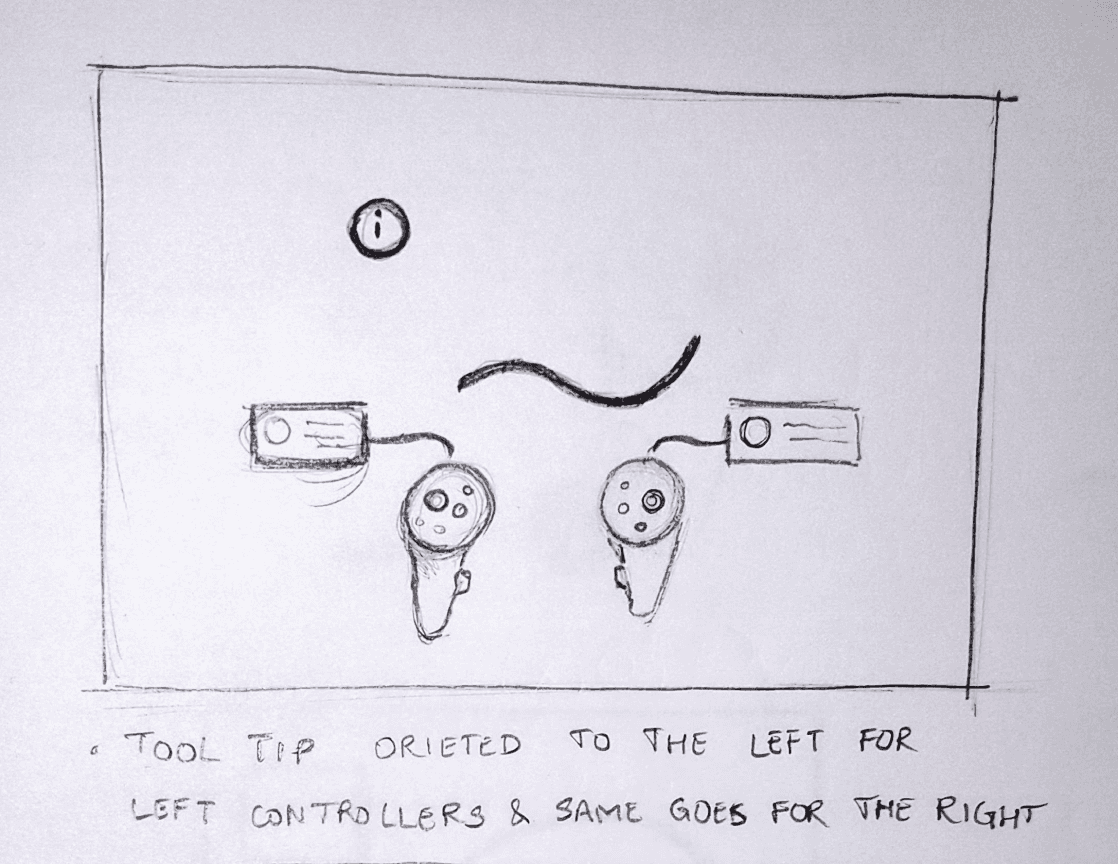
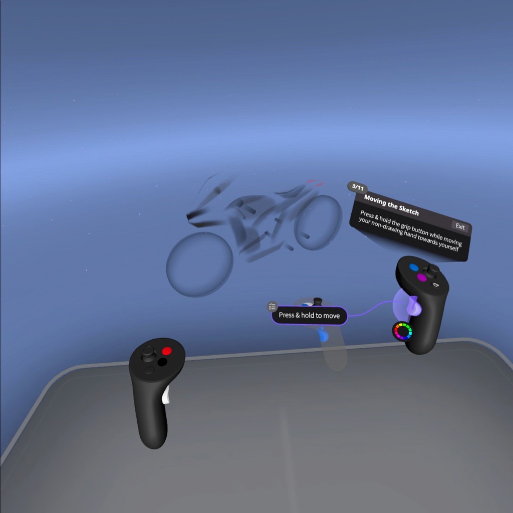
Controller Orientation: Tooltips align with each controller.
Controller Orientation: Tooltips align with each controller.
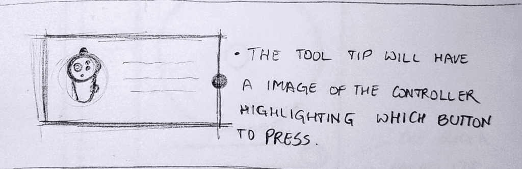
Button Highlighting: Tooltips show which button to press.
Button Highlighting: Tooltips show which button to press.
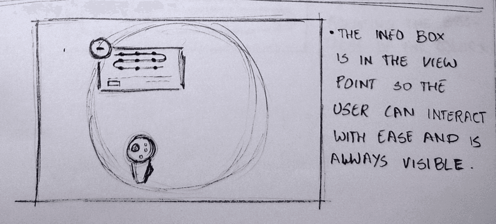
Info Box: Positioned for easy visibility and interaction.
Info Box: Positioned for easy visibility and interaction.
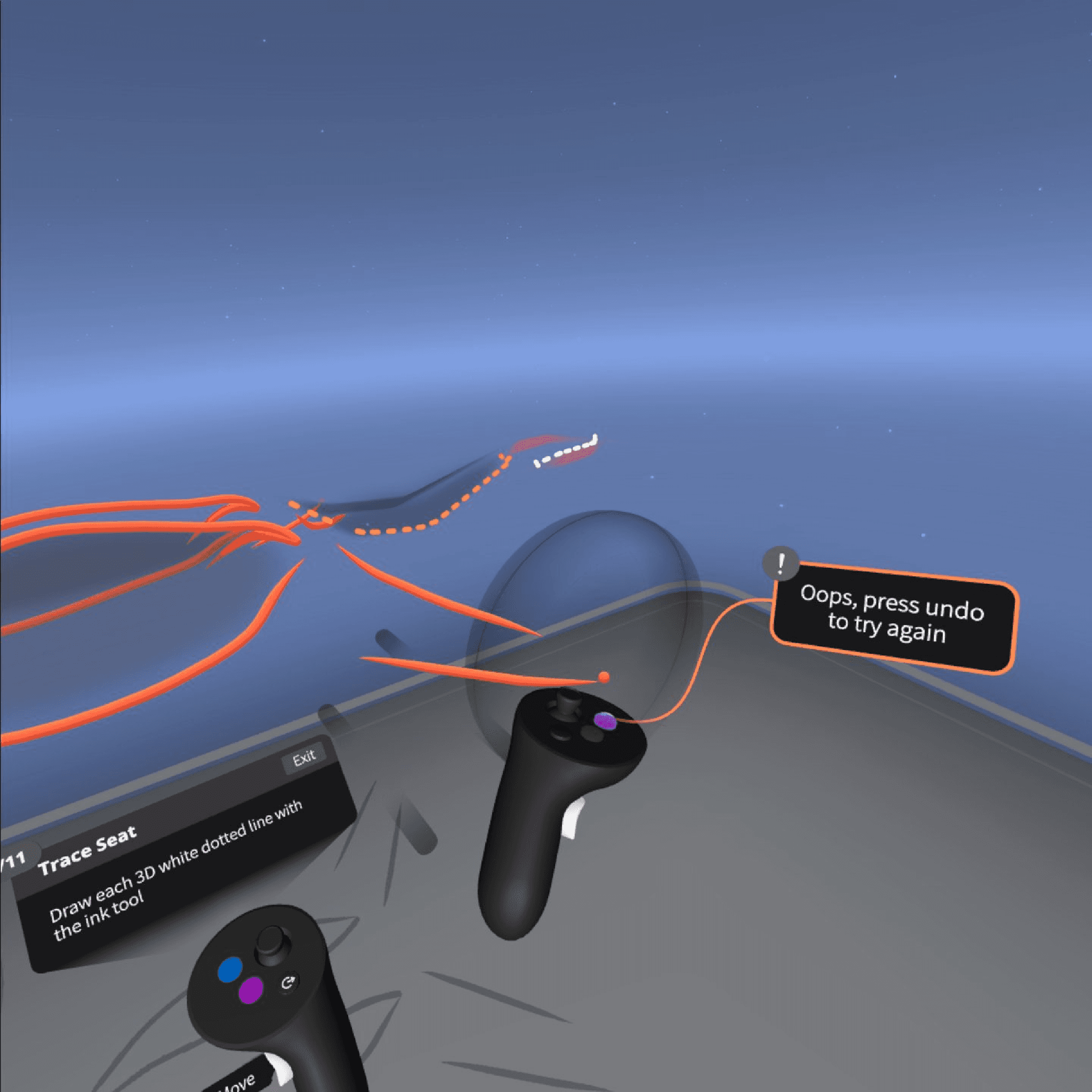
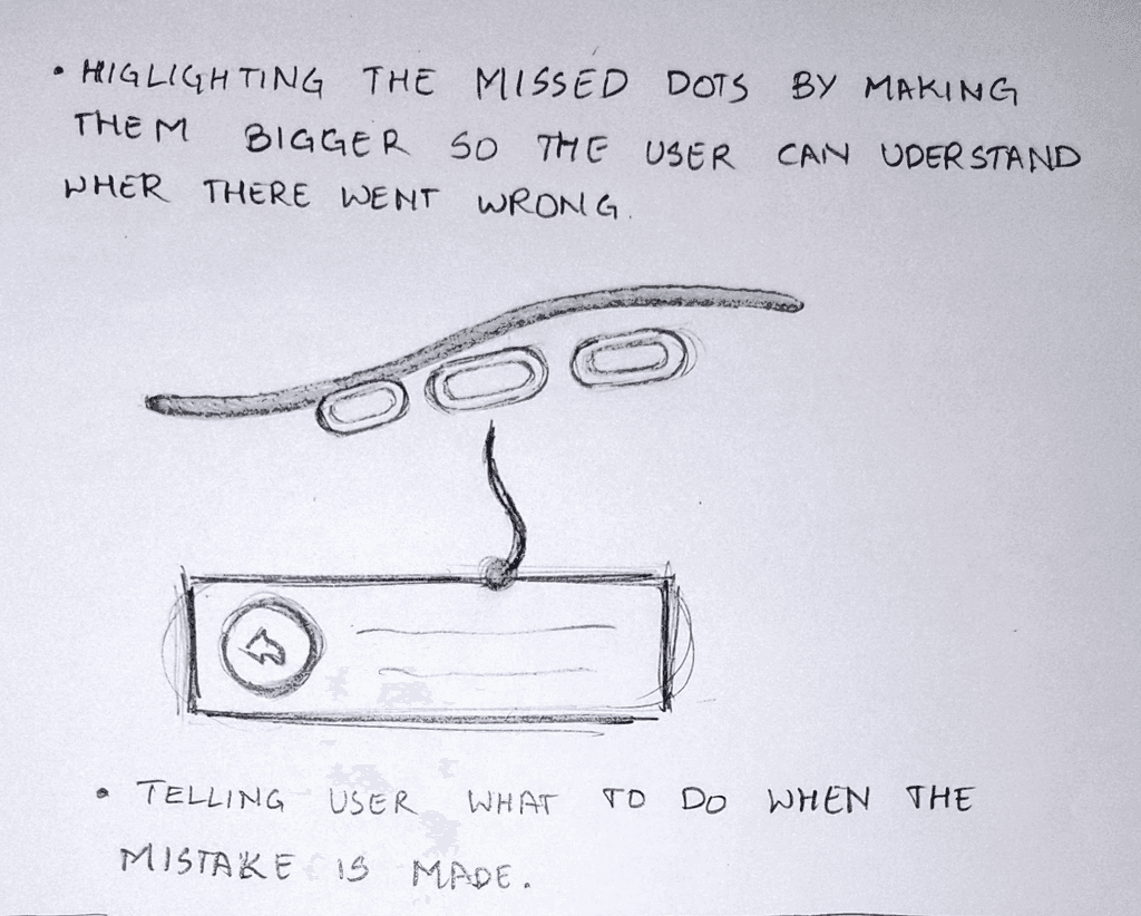
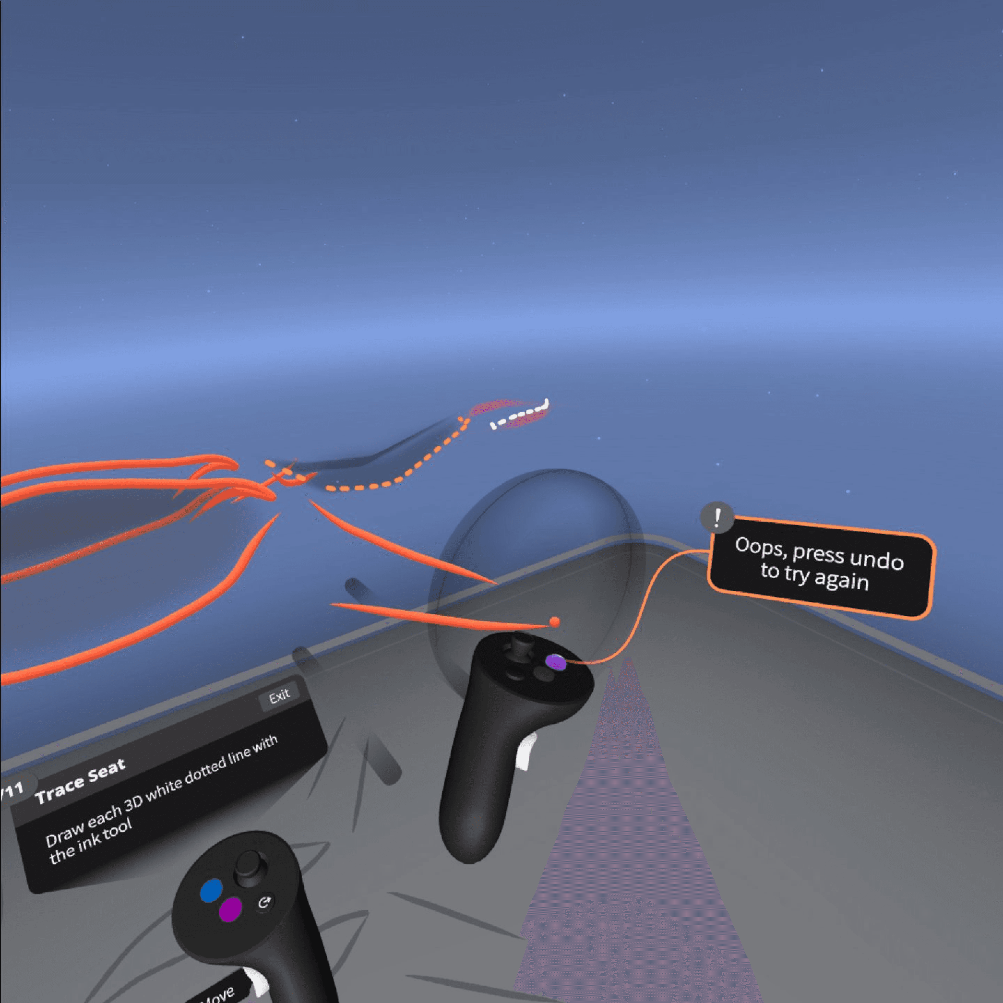
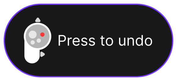
Error Highlighting:
Enlarged dots show mistakes.
Error Highlighting: Enlarged dots show mistakes.
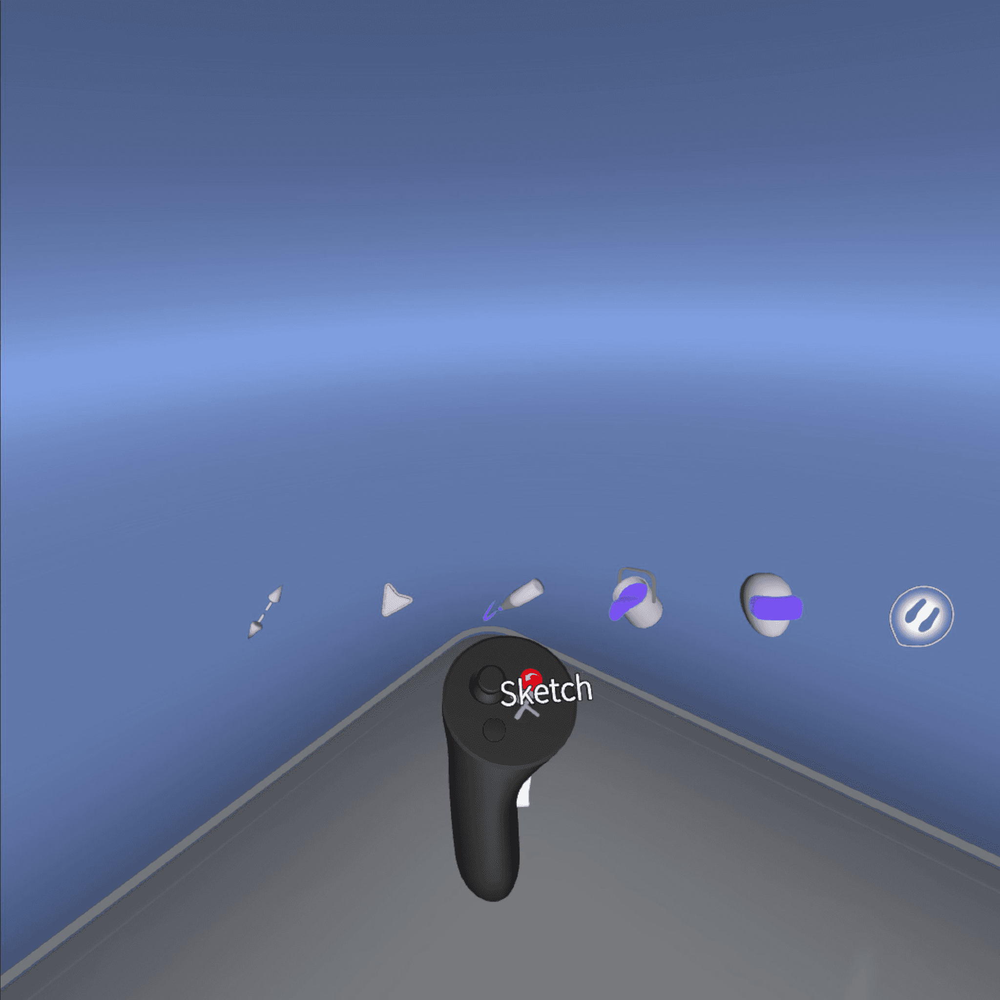
Active/Inactive States:
Icons enlarge with labels for clarity.
Active/Inactive States: Icons enlarge with labels for clarity.
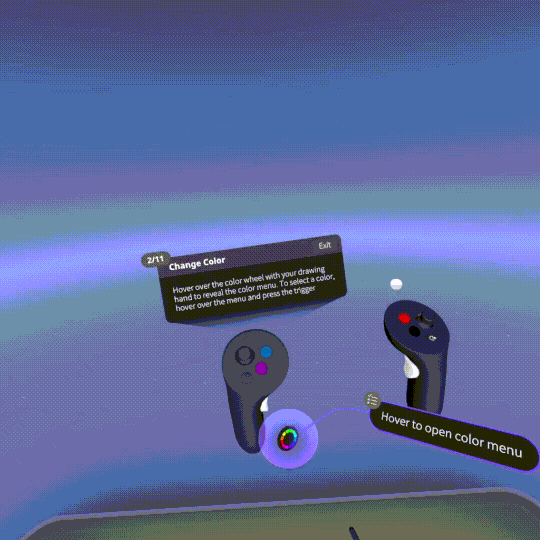
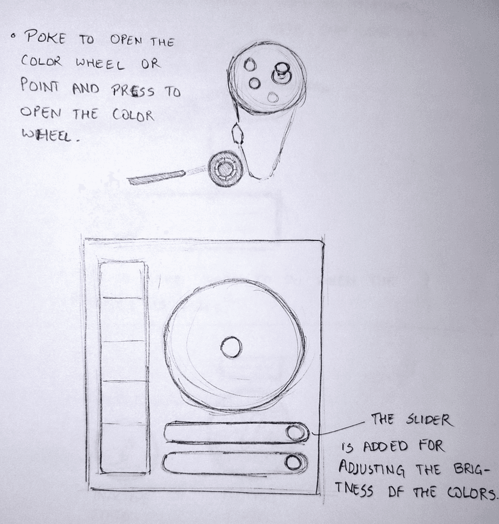
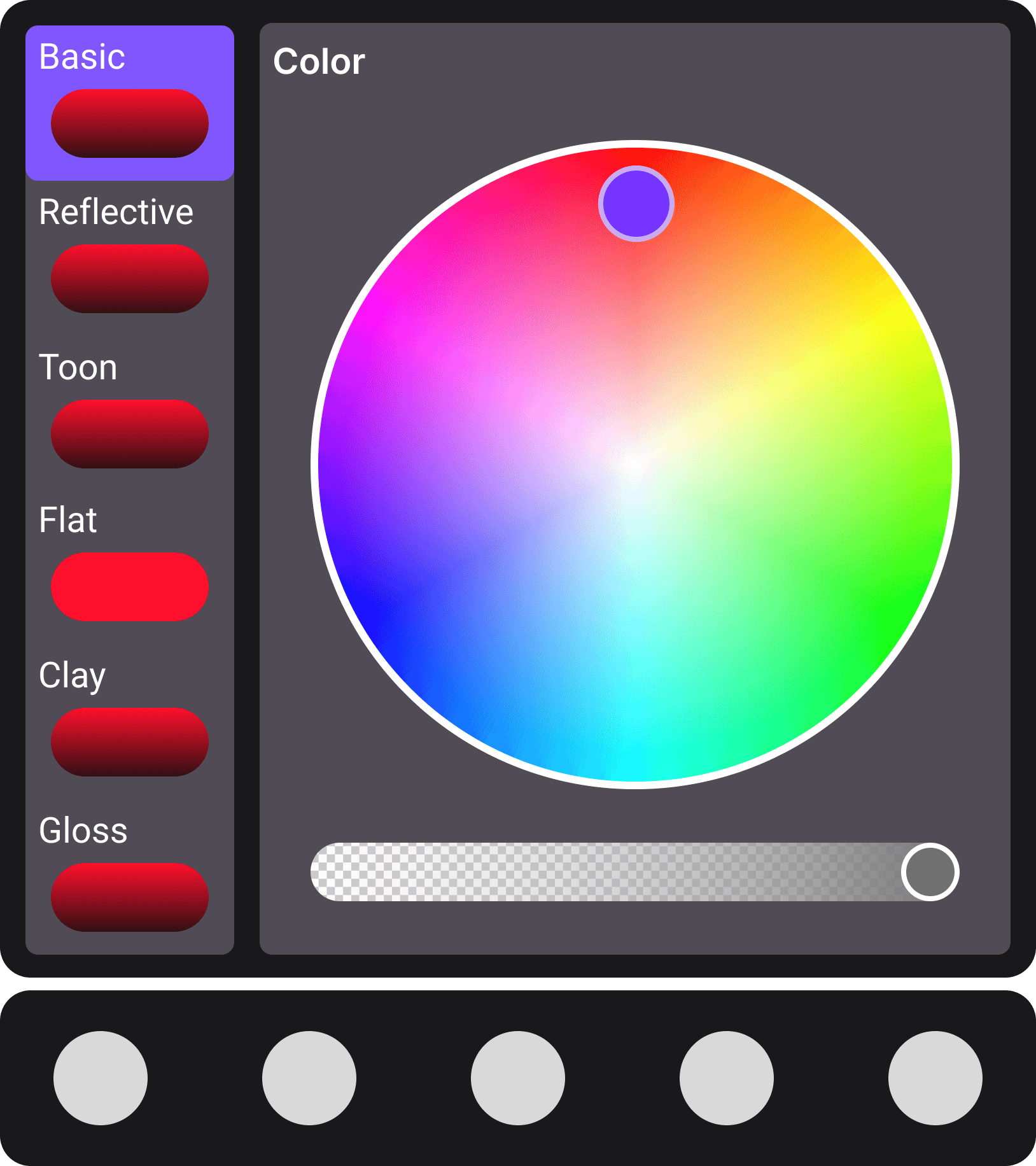
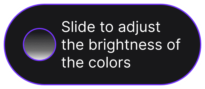
Color Wheel:
Poke or press to open, with brightness sliders.
Color Wheel: Poke or press to open, with brightness sliders.

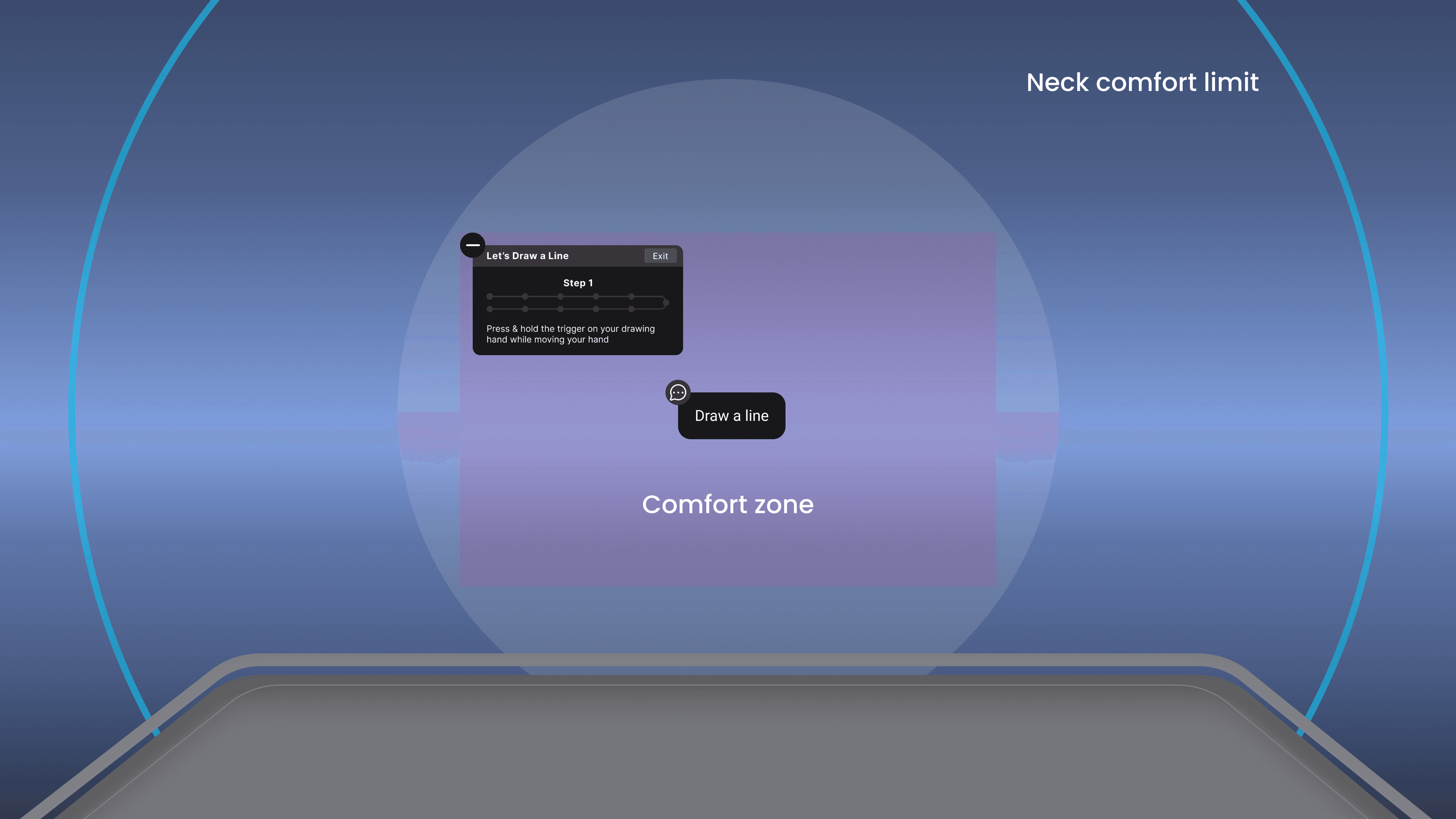
Understanding VR Space
This screen mock up shows the comfort zone and the neck comfort limit in the VR space.
The comfort zone spans upto 60 degrees and the neck comfort limit spans up to 120 degrees.
Proposed Layout

Proposal 1
Proposal 1

Old Design
Small Step Indicator: Hard-to-read step number in the
top left.
No Progress Bar: No visual progress tracking.
Basic Instructions: Instructions lacked clear structure.
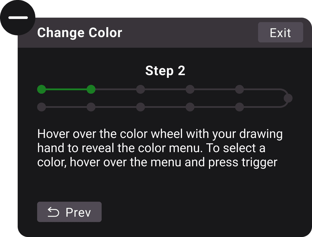
Step 2
Change Color
Exit
Hover over the color wheel with your drawing hand to reveal the color menu. To select a color, hover over the menu and press trigger
Prev
Step 2
Change Color
Exit
Hover over the color wheel with your drawing hand to reveal the color menu. To select a color, hover over the menu and press trigger
Prev
Step 2
Change Color
Exit
Hover over the color wheel with your drawing hand to reveal the color menu. To select a color, hover over the menu and press trigger
Prev
New Design
Minimize Button: Added to hide and reopen the info box as needed.
Clear Step Indicator: Moved to the center with larger text for easy visibility.
Progress Bar: Added to show how much of the tutorial is completed.
Structured Instructions: Clear, step-specific instructions at the bottom.
Previous Step Button: Introduced a button to go back to the previous step.
Proposal 2
Proposal 2


Basic
Color
Reflective
Toon
Flat
Clay
Gloss

Old Design
Basic
Color
Reflective
Toon
Flat
Clay
Gloss
Basic
Color
Reflective
Toon
Flat
Clay
Gloss
Basic
Color
Reflective
Toon
Flat
Clay
Gloss

New Design
Proposal 3
Proposal 3
Old Design
New Design
Proposal 4
Proposal 4

Old Design
New Design
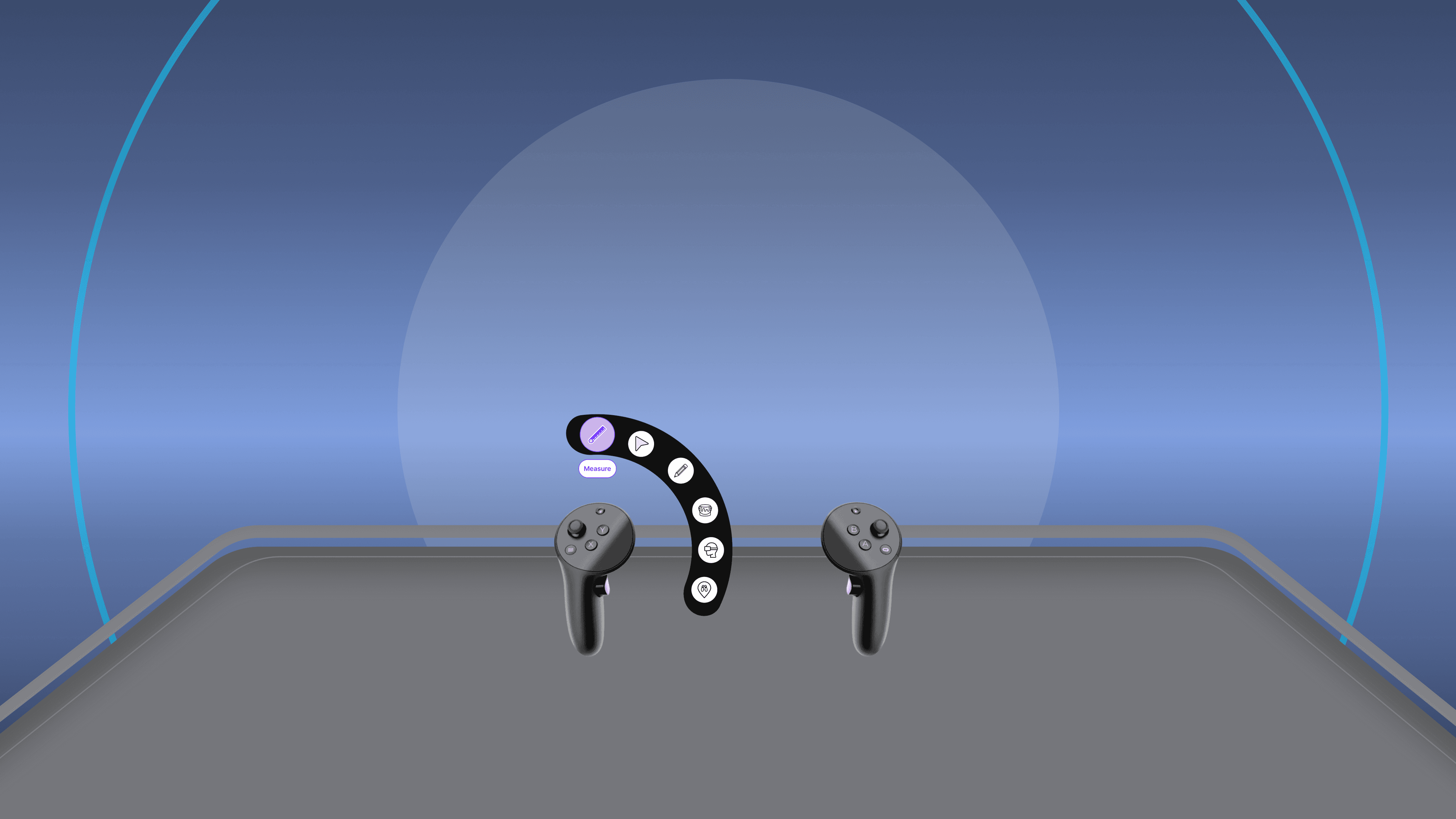
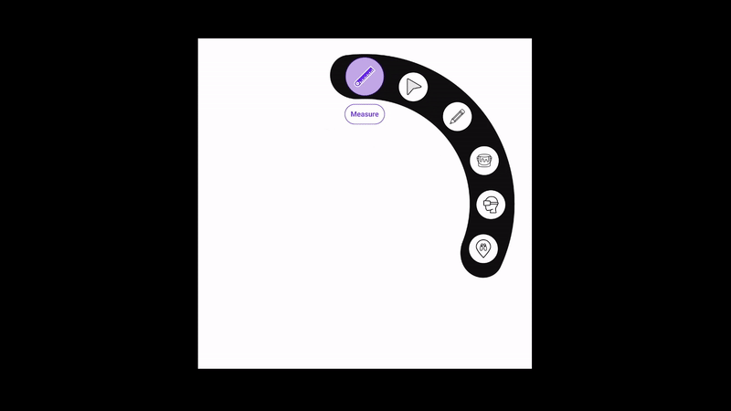
Measure
Measure
Measure
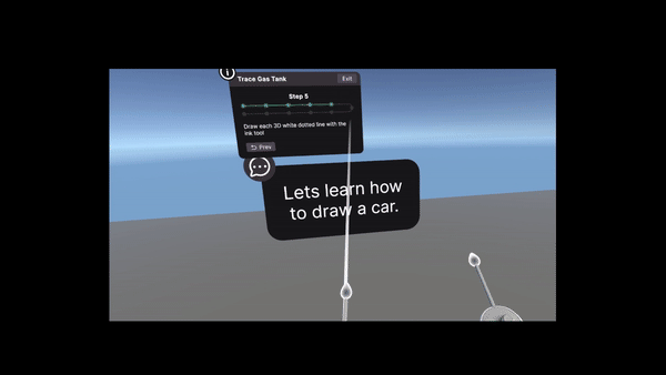
Ink Tool
Ink Tool
Ink Tool
Proposal 5
Proposal 5

Old Design


New Design
Testing
Testing
Information Box

Fixed Info Box: Placed in the top left corner of the user's view.
Gaze-Following Interaction: The info box followed the user's gaze, remaining pinned to a specific point regardless of where they looked.
User Feedback
Positive
Some users found it acceptable and easy to locate.
Negative
Others reported motion sickness due to the constant following movement of the info box.
Info Box Position: Fixed to the left of the user's peripheral vision.
Head Movement Requirement: Users had to turn their heads to the left each time they needed to view or access the info box.
User Feedback
Positive
Some users liked that the info box was out of their direct view, reducing distractions.
Negative
Many found it inconvenient to turn their heads every time they needed to interact with the info box.
Fixed Info Box: Positioned in the top left corner of the viewport, remaining static and not following the user's gaze.
No Gaze-Following: Unlike previous iterations, the info box stayed in a fixed position, providing a stable point of reference.
User Feedback
Positive
All users appreciated the fixed placement, finding it convenient and easily accessible without causing distractions.
Negative
None, as this solution was accepted by all users.
Outcome
The top-left corner placement (Iteration 3) was preferred for being less intrusive and easily accessible.
UX Law/Heuristic Satisfied
Visibility of System Status: Clear placement of instructions kept users informed.
Aesthetic and Minimalist Design: Reduced clutter, avoiding distraction from the workspace.

Results
Results
Redesigned Color Wheel
Redesigned Color Wheel
35%
35%
time taken for color selection, improving overall workflow efficiency.
time taken for color selection, improving overall workflow efficiency.
Improved Instruction Box Placement
Improved Instruction Box Placement
40%
40%
task completion speed due to reduced visual obstruction and better focus.
task completion speed due to reduced visual obstruction and better focus.
Tools Menu Redesign
Tools Menu Redesign
25%
25%
navigation time, leading to an overall smoother and more intuitive user experience.
navigation time, leading to an overall smoother and more intuitive user experience.
Enhanced Visual Cues
Enhanced Visual Cues
30%
30%
accuracy of task completion and a significant reduction in user frustration during error-prone tasks.
accuracy of task completion and a significant reduction in user frustration during error-prone tasks.
Feedback Mechanism
Feedback Mechanism
20%
20%
user satisfaction and confidence when performing tasks, with errors being recognized and corrected faster.
user satisfaction and confidence when performing tasks, with errors being recognized and corrected faster.
Background
Background

What is Gravity Sketch ?
What is Gravity Sketch ?
It is a VR design tool that allows users to create 3D models and visual concepts in a virtual environment. While it’s powerful for experienced designers, new users often found the tool difficult to learn.
It is a VR design tool that allows users to create 3D models and visual concepts in a virtual environment. While it’s powerful for experienced designers, new users often found the tool difficult to learn.
Psychology of First-Time VR Users
Psychology of First-Time VR Users
First-time VR users can experience confusion and discomfort due to the unfamiliarity of immersive environments. They need a gradual introduction to minimize sensory overload.

Importance of Onboarding Tutorials
Importance of Onboarding Tutorials
First-time VR users can experience confusion and discomfort due to the unfamiliarity of immersive environments. They need a gradual introduction to minimize sensory overload.
First-time VR users can experience confusion and discomfort due to the unfamiliarity of immersive environments. They need a gradual introduction to minimize sensory overload.
Problem Statement
Problem Statement
"Complexity in onboarding can break the excitement of exploring a new tool, turning curiosity into frustration and ultimately pushing users away."
"Complexity in onboarding can break the excitement of exploring a new tool, turning curiosity into frustration and ultimately pushing users away."


Target Audience
Target Audience
New VR users exploring the interface for the first time.
New VR users exploring the interface for the first time.
Designers, artists, and 3D modelers seeking a creative tool for their workflows.
Designers, artists, and 3D modelers seeking a creative tool for their workflows.
Academics looking to learn or teach 3D modeling and VR design.
Academics looking to learn or teach 3D modeling and VR design.
Tech enthusiasts exploring new tools and features in VR environments.
Tech enthusiasts exploring new tools and features in VR environments.
Pain Points
Pain Points
Overwhelming visual cues.
Overwhelming visual cues.
Confusing interactions and controls.
Confusing interactions and controls.
Lack of adaptability for different skill levels.
Lack of adaptability for different skill levels.
Overview
Overview
This project focuses on redesigning the onboarding tutorial for Gravity Sketch, a VR design tool.
The goal was to simplify the complex UI and improve the onboarding experience, making it more intuitive and engaging for new users.
This case study will showcase the design thinking process behind the changes, the UI improvements made, and the impact of these changes.
My Role
My Role
Visual Design | User Experience | Virtual Reality
Visual Design | User Experience | Virtual Reality
My Team
My Team
Rohit Tulasi (Me)
Rohit Tulasi (Me)
Project Type
Project Type
UI Redesign | UX Design | VR Design
UI Redesign | UX Design | VR Design
Tools Used
Tools Used
Figma
Figma
Unity
Unity
Challenge
The original onboarding had too many visual cues appearing simultaneously, resulting in
cognitive overload.
Interactions were confusing and lacked user control, making it hard for users to feel comfortable navigating the tutorial.
The feedback mechanisms were inaccurate, leading to uncertainty and frustration during the
learning process.
Solution
Redesigned the onboarding UI to provide a clearer, more guided experience with reduced cognitive load.
Enhanced interactions to be more intuitive and provide users with a better sense of control.
Implemented more accurate and meaningful feedback mechanisms to facilitate learning.
Key Results
Key Results
Reduced visual overload by
50%
improving user engagement during the onboarding tutorial.
Increased user control by
40%
through intuitive interactions and feedback.
Boosted task completion rates by
35%
with more accurate feedback leading to faster user onboarding.
Reduced visual overload by
50%
improving user engagement during the onboarding tutorial.
Increased user control by
40%
through intuitive interactions and feedback.
Boosted task completion rates by
35%
with more accurate feedback leading to faster user onboarding.
Case Study
Redesigning Gravity Sketch’s Onboarding Tutorial to Enhance the User Experience
Redesigning Gravity Sketch’s Onboarding Tutorial to Enhance the User Experience


Conclusion
Conclusion


R T Designs
Thank you for your interest in my work!
Navigation
Home
About
Projects
About
Home
R T Designs
Thank you for your interest in my work!
Navigation
Projects
Home
About
Thank you for your interest in my work!
R T Designs
Navigation
Projects
Home
About
Old Design
New Design
Press & hold to draw
Let’s Draw a Line
Exit
Press & hold the trigger on your drawing hand while moving your hand
1/11
Old Design
Step 1
Let’s Draw a Line
Exit
Press & hold the trigger on your drawing hand while moving your hand
Press & hold to draw
New Design
Before & after of Onboarding Design
1
Discovery
2
Ideation
3
Testing
4
Results
Discovery
Literature Review
Onboarding ensures a smooth transition and helps users understand the VR environment.
Focused on reducing motion sickness, cognitive overload, and user confusion.
Recommended step-by-step guidance and gradual feature reveal to enhance learning.
Suggested adaptable tutorials to accommodate different learning styles and experience levels.
Emphasized seamless integration, prioritizing clarity and comfort for new users.
Secondary Research
Key elements include interactive tutorials, clear visual cues, and feedback mechanisms.
Focused on intuitive navigation and ergonomic design for extended VR use.
Examined successful VR apps like Oculus Quill and Tilt Brush, noting segmented tutorials and adaptive guidance.
Effective onboarding boosts user retention and satisfaction.
Stressed practical scenarios and safe environments for learning VR interactions.
Survey Results
18- 24 age group
54%
76%
Find dedicated onboarding tutorials very important
Find dedicated onboarding tutorials very important
72%
Would likely abandon a VR app if the onboarding is too difficult
89%
Report that lack of clear instructions reduces enjoyment of VR apps.
80%
Believe interactive tutorials would significantly improve initial VR app experiences
Clarity and simplicity are crucial for onboarding.
Lack of guidance leads to frustration and potential abandonment.
Usability Test and
Heuristic Evaluation Summary
Confusion Over Visual Cues
Violation : Visibility of System Status and Recognition Rather Than Recall.
Issue : Multiple visual cues are presented simultaneously, overwhelming users and causing confusion about which action to take.
"Why am i seeing these many tips? which one should I do first?"
Unintended Color Changes
Violation : User Control and Freedom, Error Prevention.
Issue : The color wheel interaction was too sensitive, causing users to unintentionally change colors.
"Why am i seeing these many tips? which one should I do first?"
Tool Selection Ambiguity
Violation : Match Between System and Real World, and Feedback.
Issue : Users were unsure if the correct tool was selected due to a lack of clear feedback.
" Did I select the right tool?"
Inaccurate Feedback
Violation : Visibility of System Status, User Control and Freedom.
Issue : The feedback mechanism was inconsistent, providing unclear guidance on task completion, leading to uncertainty and frustration.
" Where did I go wrong?"
Ideation
I begin my design process by sketching out rough ideas on paper. This helps me quickly iterate and shape my approach towards finals designs.
Controller Orientation: Tooltips align with each controller.
Button Highlighting: Tooltips show which button to press.
Info Box: Positioned for easy visibility and interaction.
Error Highlighting: Enlarged dots show mistakes.
Active/Inactive States: Icons enlarge with labels for clarity.
Color Wheel: Poke or press to open, with brightness sliders.
Understanding VR Space
This screen mock up shows the comfort zone and the neck comfort limit in the VR space.
The comfort zone spans upto 60 degrees and the neck comfort limit spans up to 120 degrees.
Proposed Layout
Proposal 1
Old Design
Small Step Indicator: Hard-to-read step number in the
top left.
No Progress Bar: No visual progress tracking.
Basic Instructions: Instructions lacked clear structure.
Step 2
Change Color
Exit
Hover over the color wheel with your drawing hand to reveal the color menu. To select a color, hover over the menu and press trigger
Prev
New Design
Minimize Button: Added to hide and reopen the info box as needed.
Clear Step Indicator: Moved to the center with larger text for easy visibility.
Progress Bar: Added to show how much of the tutorial is completed.
Structured Instructions: Clear, step-specific instructions at the bottom.
Previous Step Button: Introduced a button to go back to the previous step.
Proposal 2
Basic
Color
Reflective
Toon
Flat
Clay
Gloss
Old Design
Basic
Color
Reflective
Toon
Flat
Clay
Gloss
New Design
Proposal 3
Old Design
New Design
Proposal 4
Old Design
New Design
Measure
Ink Tool
Proposal 5
Old Design
New Design
Testing
Information Box
Fixed Info Box: Placed in the top left corner of the user's view.
Gaze-Following Interaction: The info box followed the user's gaze, remaining pinned to a specific point regardless of where they looked.
User Feedback
Positive
Some users found it acceptable and easy to locate.
Negative
Others reported motion sickness due to the constant following movement of the info box.
Info Box Position: Fixed to the left of the user's peripheral vision.
Head Movement Requirement: Users had to turn their heads to the left each time they needed to view or access the info box.
User Feedback
Positive
Some users liked that the info box was out of their direct view, reducing distractions.
Negative
Many found it inconvenient to turn their heads every time they needed to interact with the info box.
Fixed Info Box: Positioned in the top left corner of the viewport, remaining static and not following the user's gaze.
No Gaze-Following: Unlike previous iterations, the info box stayed in a fixed position, providing a stable point of reference.
User Feedback
Positive
All users appreciated the fixed placement, finding it convenient and easily accessible without causing distractions.
Negative
None, as this solution was accepted by all users.
Outcome
The top-left corner placement (Iteration 3) was preferred for being less intrusive and easily accessible.
UX Law/Heuristic Satisfied
Visibility of System Status: Clear placement of instructions kept users informed.
Aesthetic and Minimalist Design: Reduced clutter, avoiding distraction from the workspace.
Results
Redesigned Color Wheel
35%
time taken for color selection, improving overall workflow efficiency.
Improved Instruction Box Placement
40%
task completion speed due to reduced visual obstruction and better focus.
Tools Menu Redesign
25%
navigation time, leading to an overall smoother and more intuitive user experience.
Enhanced Visual Cues
30%
accuracy of task completion and a significant reduction in user frustration during error-prone tasks.
Feedback Mechanism
20%
user satisfaction and confidence when performing tasks, with errors being recognized and corrected faster.
Background
What is Gravity Sketch ?
It is a VR design tool that allows users to create 3D models and visual concepts in a virtual environment. While it’s powerful for experienced designers, new users often found the tool difficult to learn.
Psychology of First-Time VR Users
First-time VR users can experience confusion and discomfort due to the unfamiliarity of immersive environments. They need a gradual introduction to minimize sensory overload.
Importance of Onboarding Tutorials
First-time VR users can experience confusion and discomfort due to the unfamiliarity of immersive environments. They need a gradual introduction to minimize sensory overload.
Problem Statement
"Complexity in onboarding can break the excitement of exploring a new tool, turning curiosity into frustration and ultimately pushing users away."
Target Audience
New VR users exploring the interface for the first time.
Designers, artists, and 3D modelers seeking a creative tool for their workflows.
Academics looking to learn or teach 3D modeling and VR design.
Tech enthusiasts exploring new tools and features in VR environments.
Pain Points
Overwhelming visual cues.
Confusing interactions and controls.
Lack of adaptability for different skill levels.
Overview
This project focuses on redesigning the onboarding tutorial for Gravity Sketch, a VR design tool.
The goal was to simplify the complex UI and improve the onboarding experience, making it more intuitive and engaging for new users.
This case study will showcase the design thinking process behind the changes, the UI improvements made, and the impact of these changes.
My Role
Visual Design | User Experience | Virtual Reality
My Team
Rohit Tulasi (Me)
Project Type
UI Redesign | UX Design | VR Design
Tools Used
Figma
Unity
Challenge
The original onboarding had too many visual cues appearing simultaneously, resulting in
cognitive overload.
Interactions were confusing and lacked user control, making it hard for users to feel comfortable navigating the tutorial.
The feedback mechanisms were inaccurate, leading to uncertainty and frustration during the
learning process.
Solution
Redesigned the onboarding UI to provide a clearer, more guided experience with reduced cognitive load.
Enhanced interactions to be more intuitive and provide users with a better sense of control.
Implemented more accurate and meaningful feedback mechanisms to facilitate learning.
Key Results
Reduced visual overload by
50%
improving user engagement during the onboarding tutorial.
Increased user control by
40%
through intuitive interactions and feedback.
Boosted task completion rates by
35%
with more accurate feedback leading to faster user onboarding.
Reduced visual overload by
50%
improving user engagement during the onboarding tutorial.
Increased user control by
40%
through intuitive interactions and feedback.
Boosted task completion rates by
35%
with more accurate feedback leading to faster user onboarding.
Case Study
Redesigning Gravity Sketch’s Onboarding Tutorial to Enhance the User Experience
Conclusion
R T Designs
Thank you for your interest in my work!
Navigation
Home
Projects
About
R T Designs
Thank you for your interest in my work!
Navigation
Projects
Home
About
Thank you for your interest in my work!
R T Designs
Navigation
Projects
Home
About